Re-Program
Overview
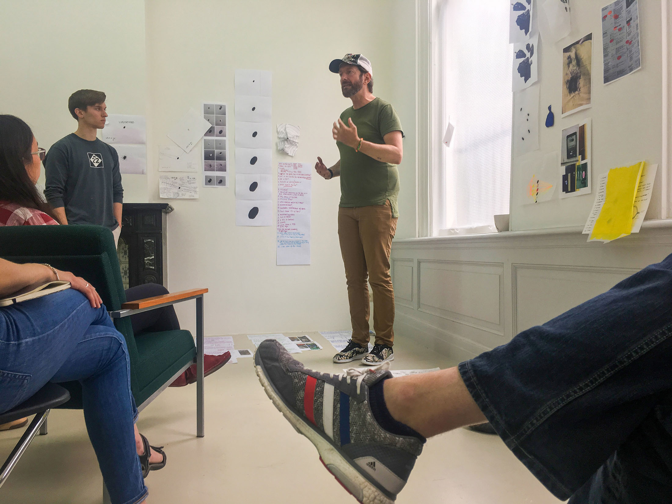
Re-Program was an intense three-week international graphic design residency that connected me with some of the best design thinkers in the Netherlands. While the sessions focus on making, building, coding, animating, writing, photographing, videoing, and other forms of articulating an idea, this is not a final product-centric experience; instead, it was an exploration of the design process and what was created around it.
Details
● 2018 residency
● Exploration of process
Introductions
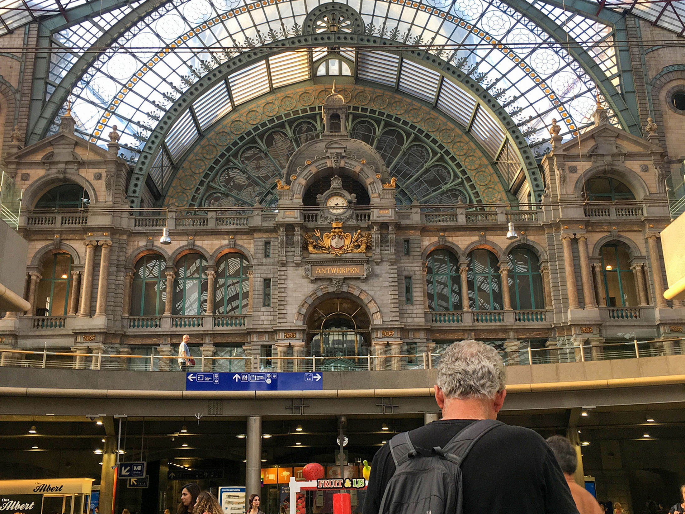
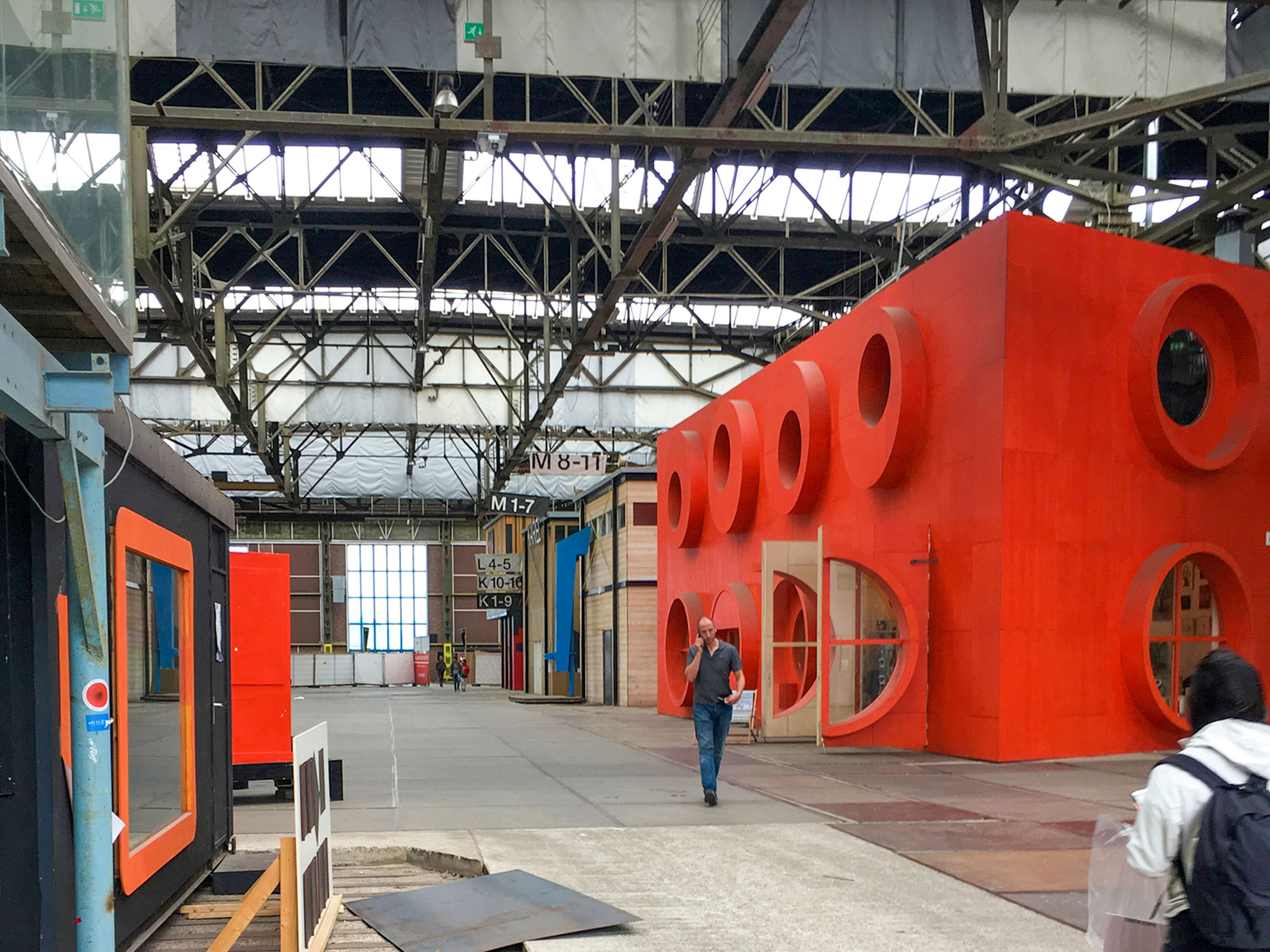
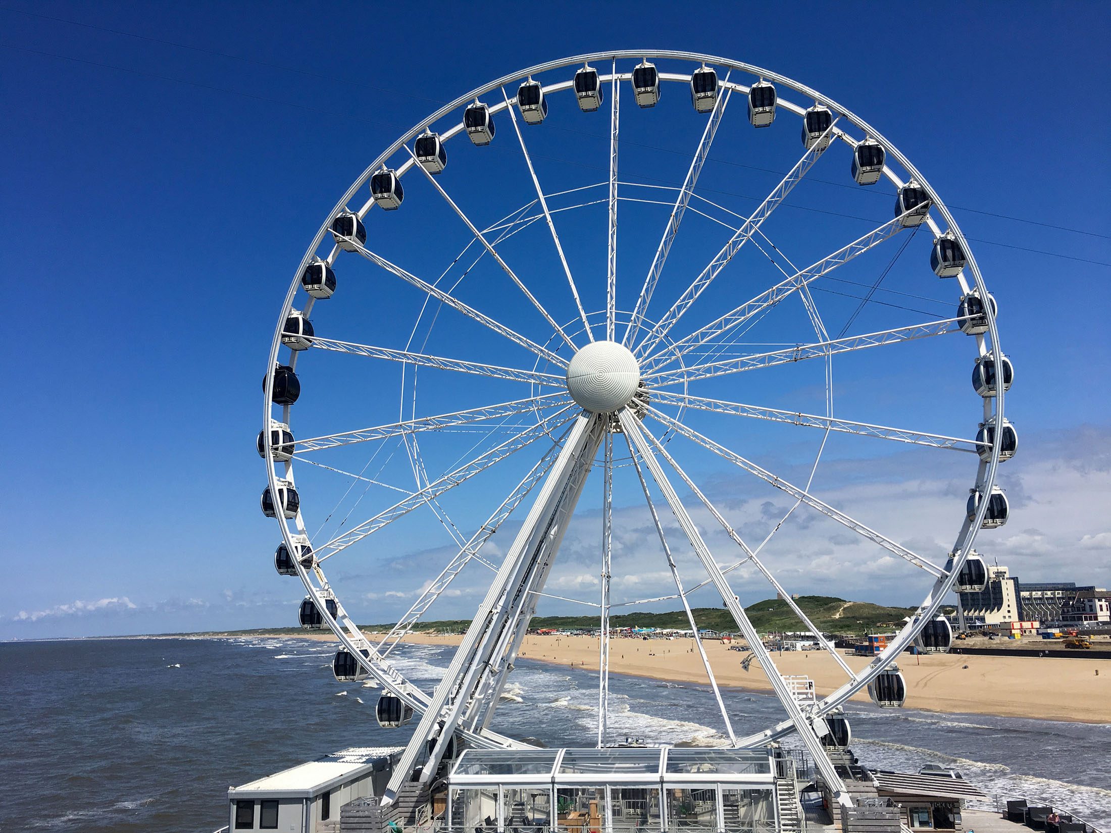
Based in Den Haag, my travels included visiting design studios, museums, private collections, design schools, and lectures from various guest critics in Dutch cities, such as Amsterdam, Arnhem, Breda, Eindhoven, Rotterdam, and Utrecht. The following is an exploration of how my ideas evolved in the three-week period, a showcase of my travels, and a log of what I created therein.


Project 1
Bob van Dijk, a Dutch graphic designer, and mentor for Project One, introduced an open-ended exercise: create or find a new perspective from what we had explored throughout our time in the Netherlands. Take the simple and mundane, and make it extraordinary using our unique viewpoints of the country.

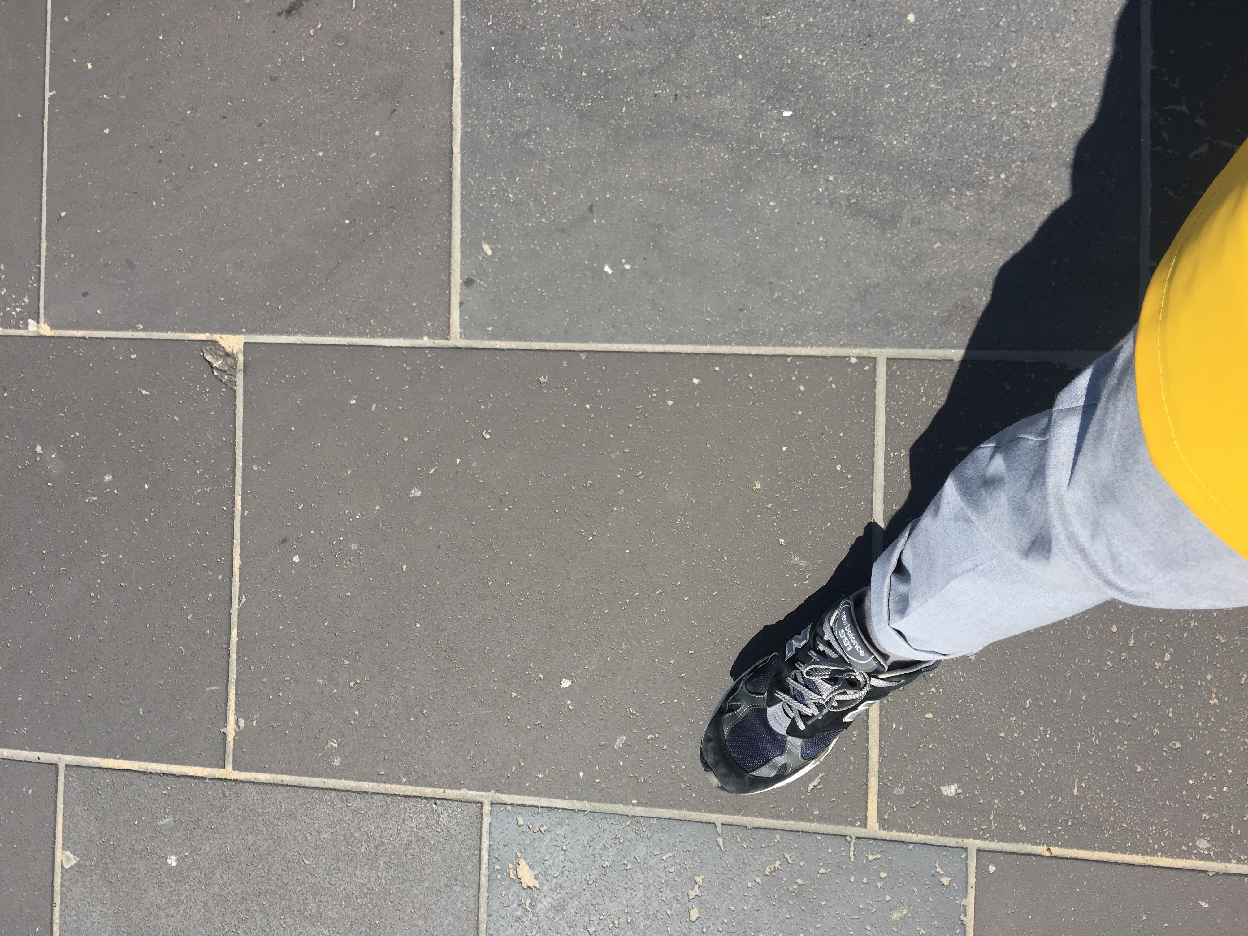
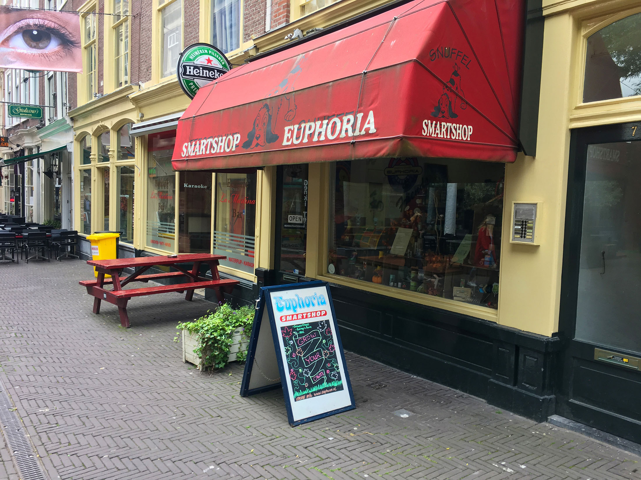
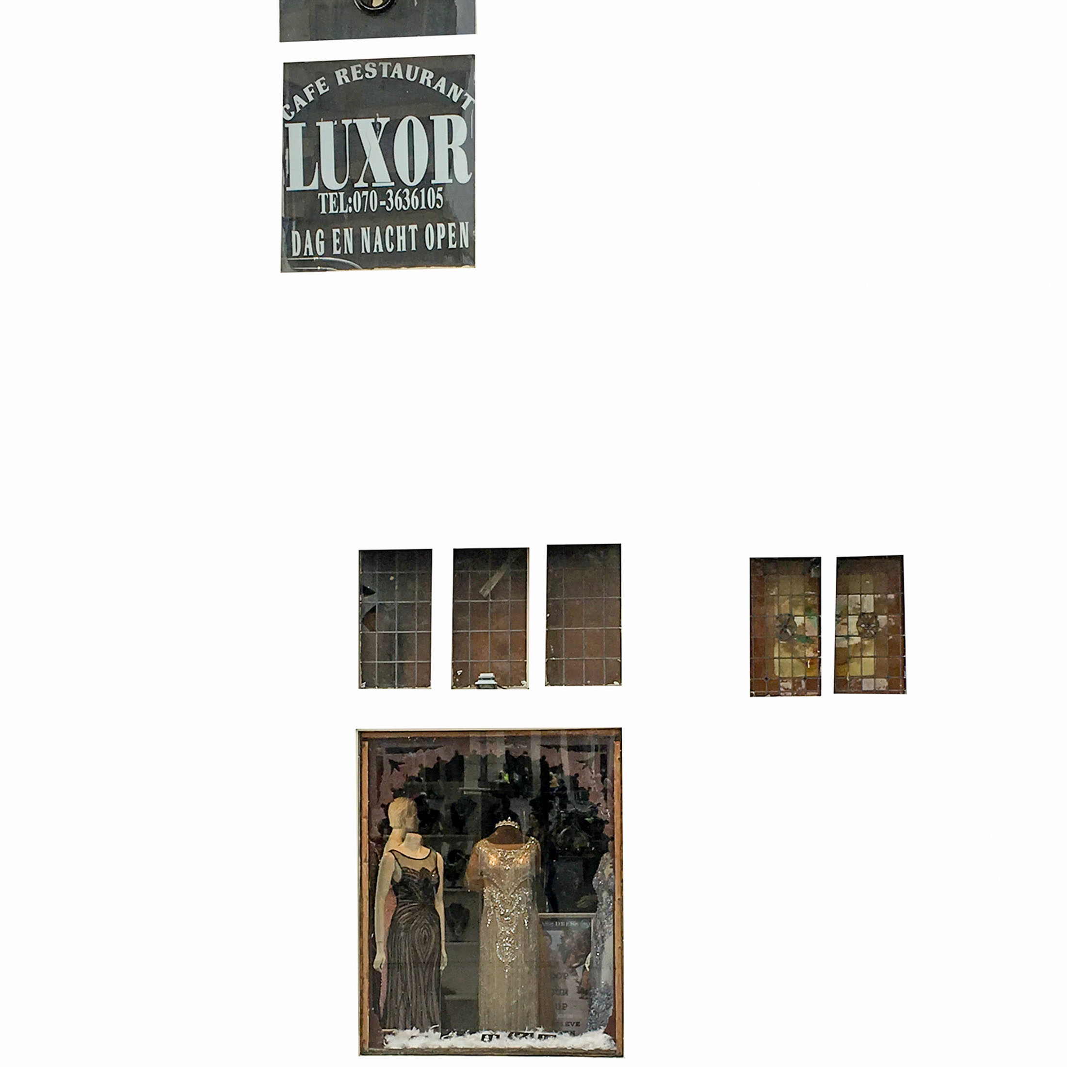
My time traveling the Dutch countryside had both inspired and confounded me. Dutch was not a native tongue of mine, with street signs and much of the city's infrastructure only doing so much to supplement my misunderstanding. It was alluring to walk down a city street with only half an idea of where I was headed, lost amongst stores built into beautiful Dutch architecture.
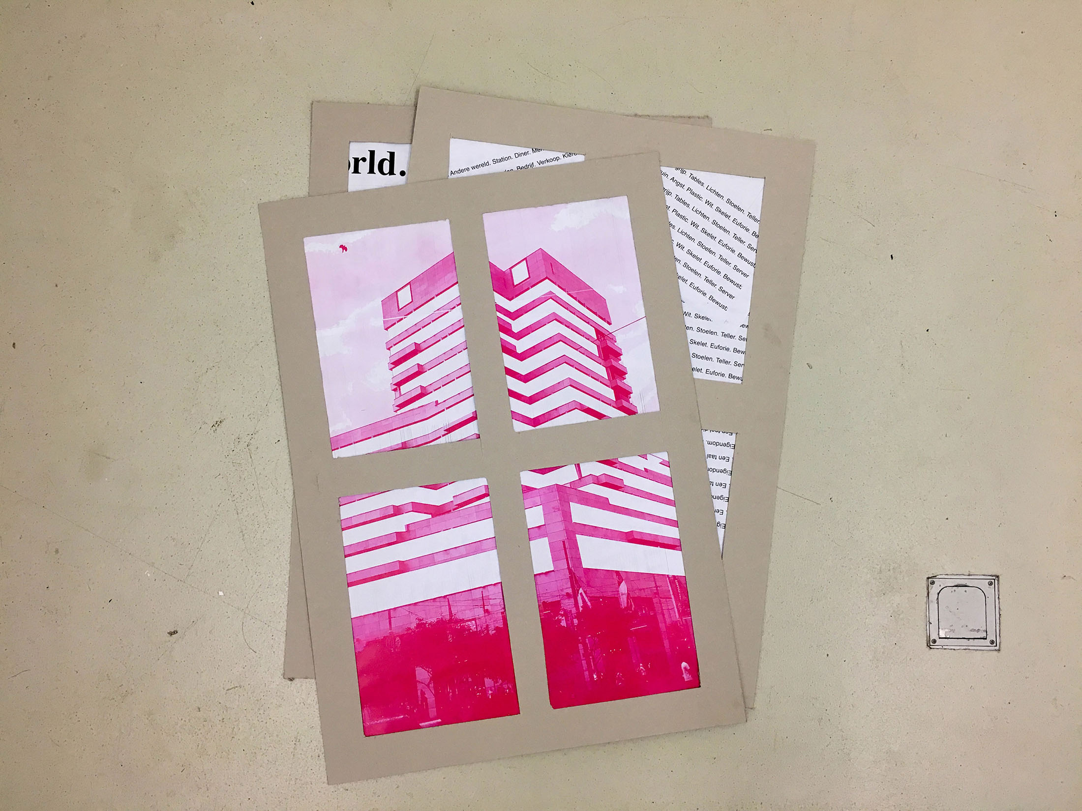
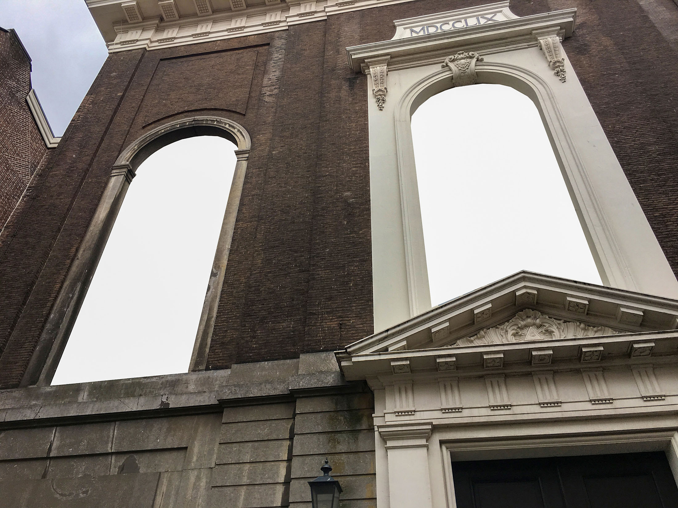
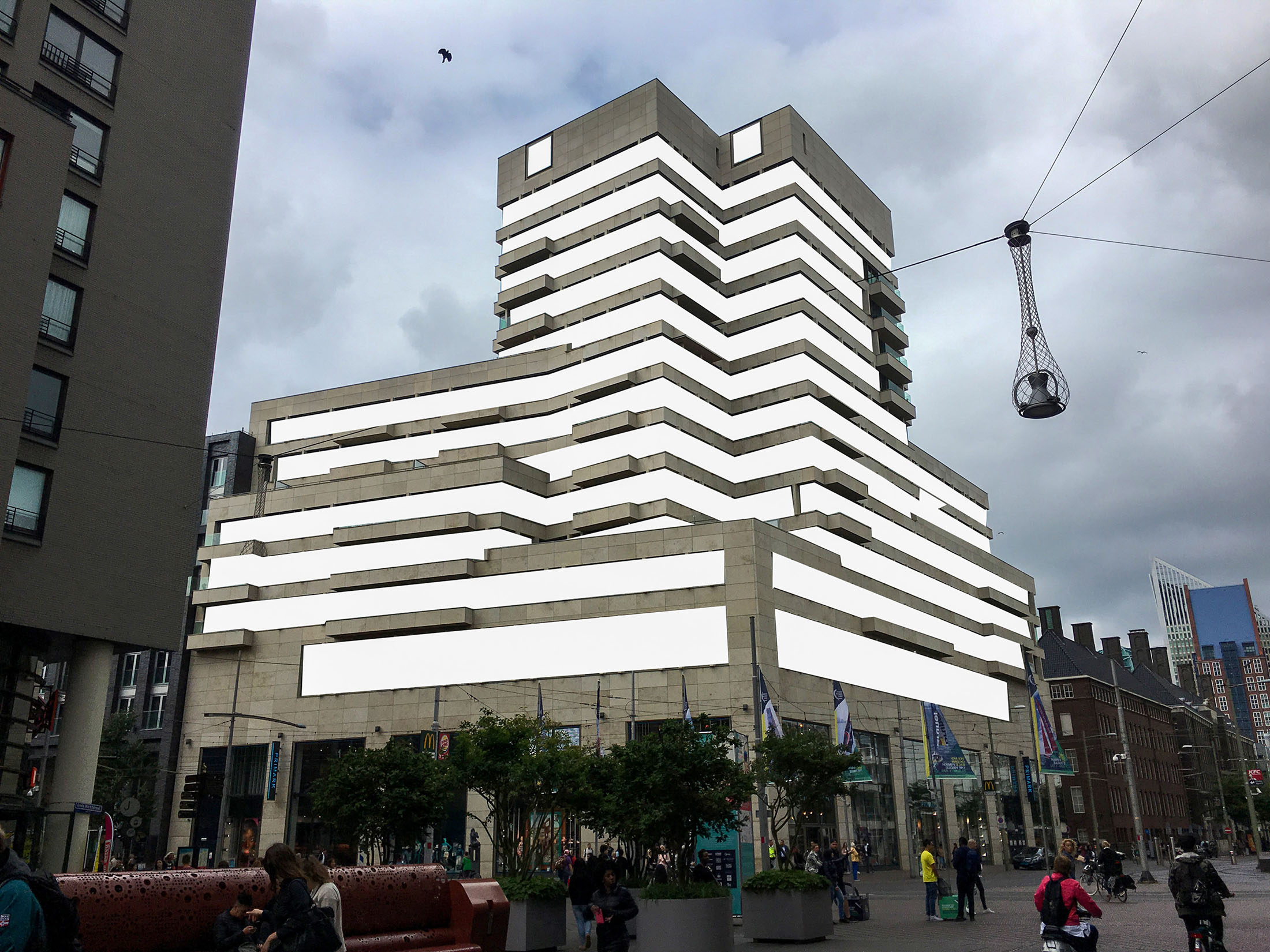
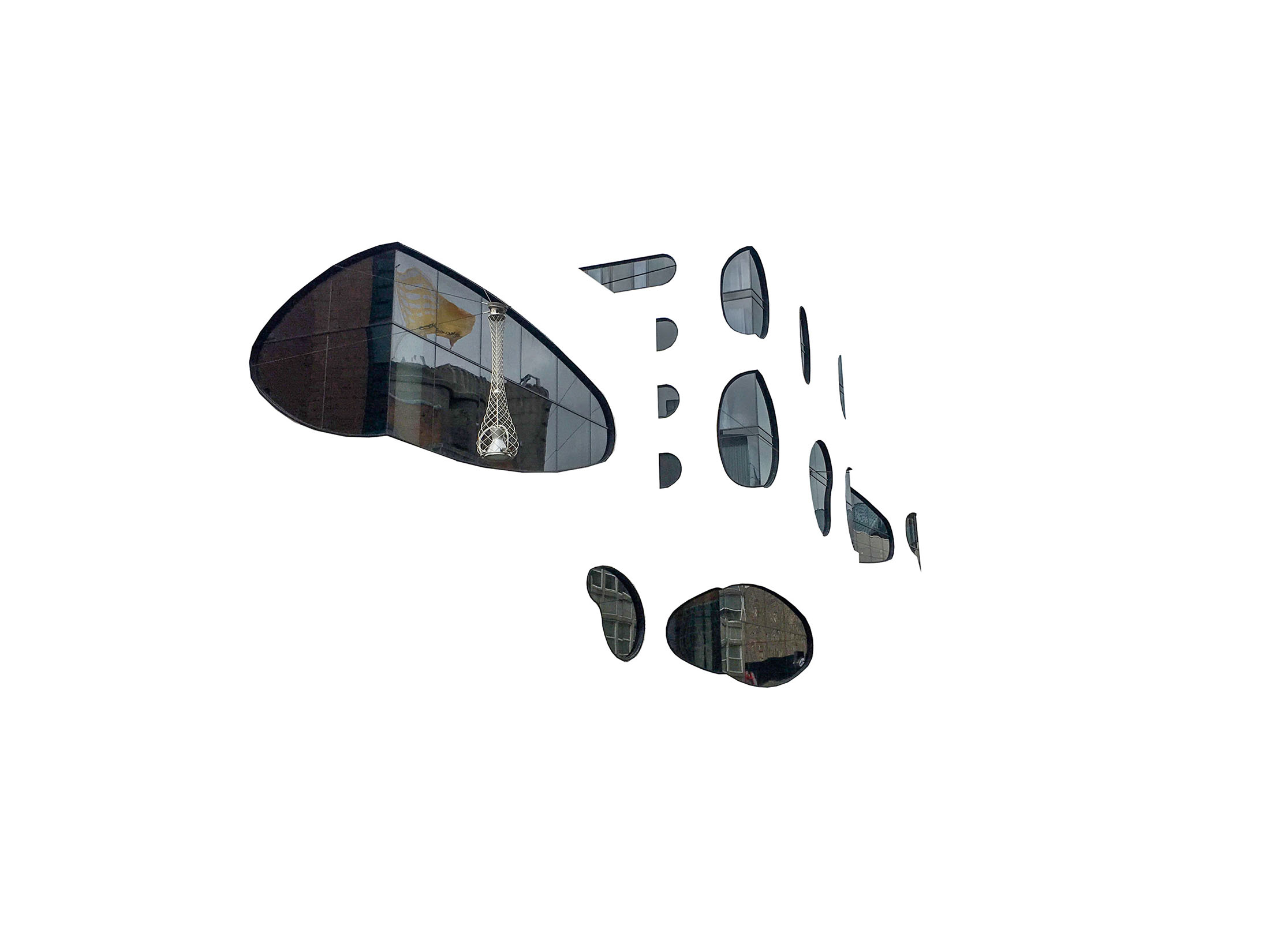
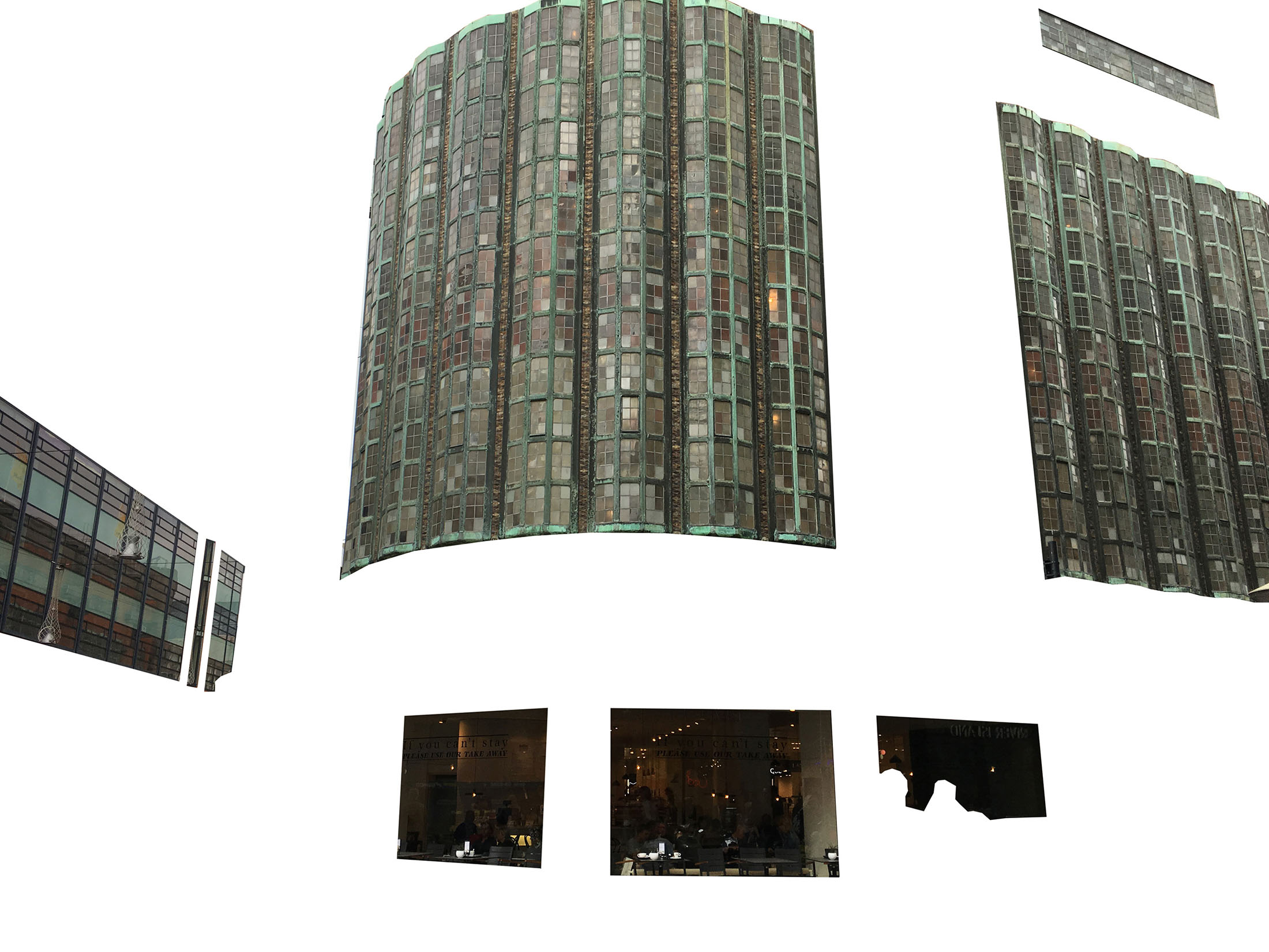
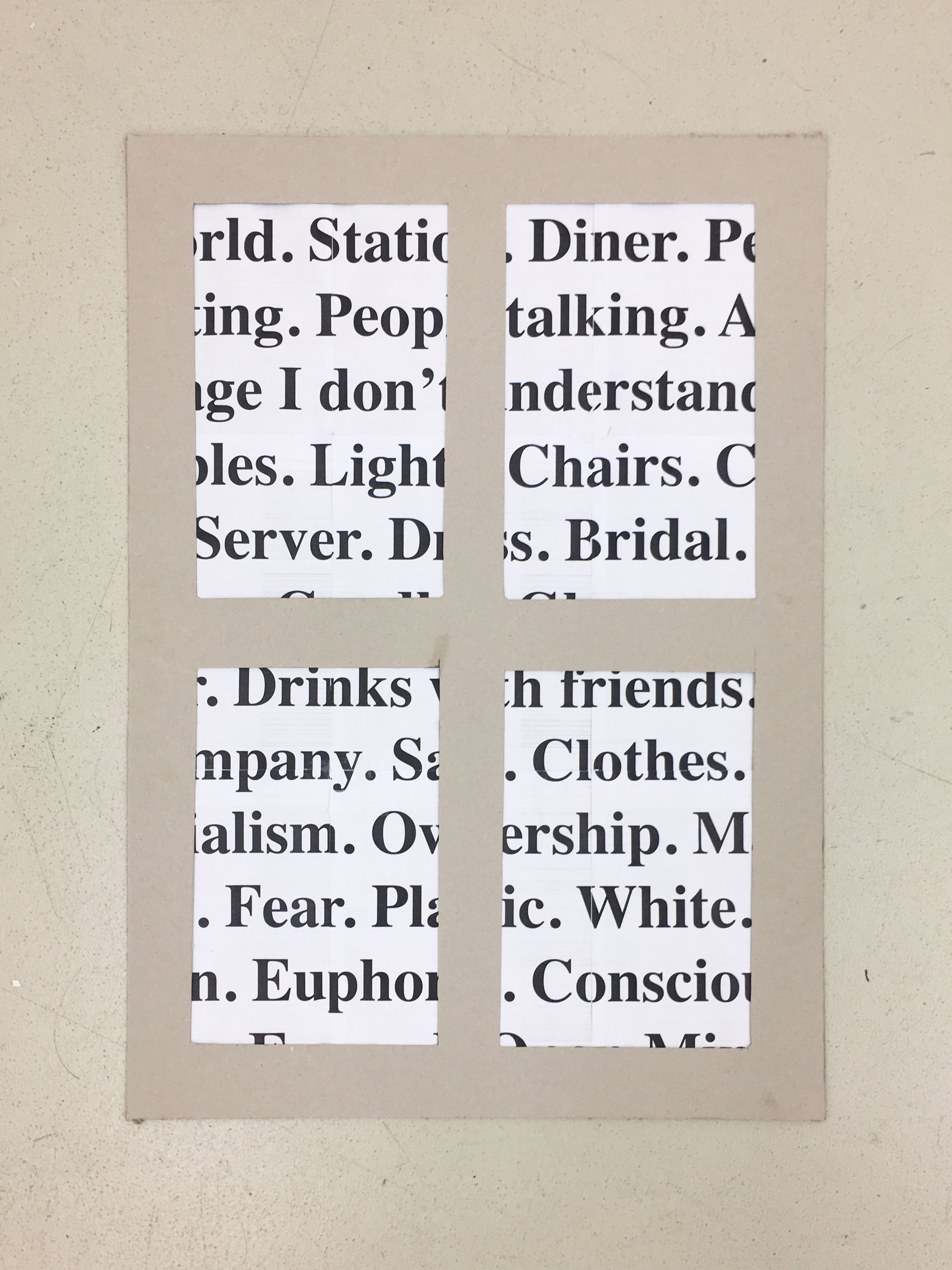
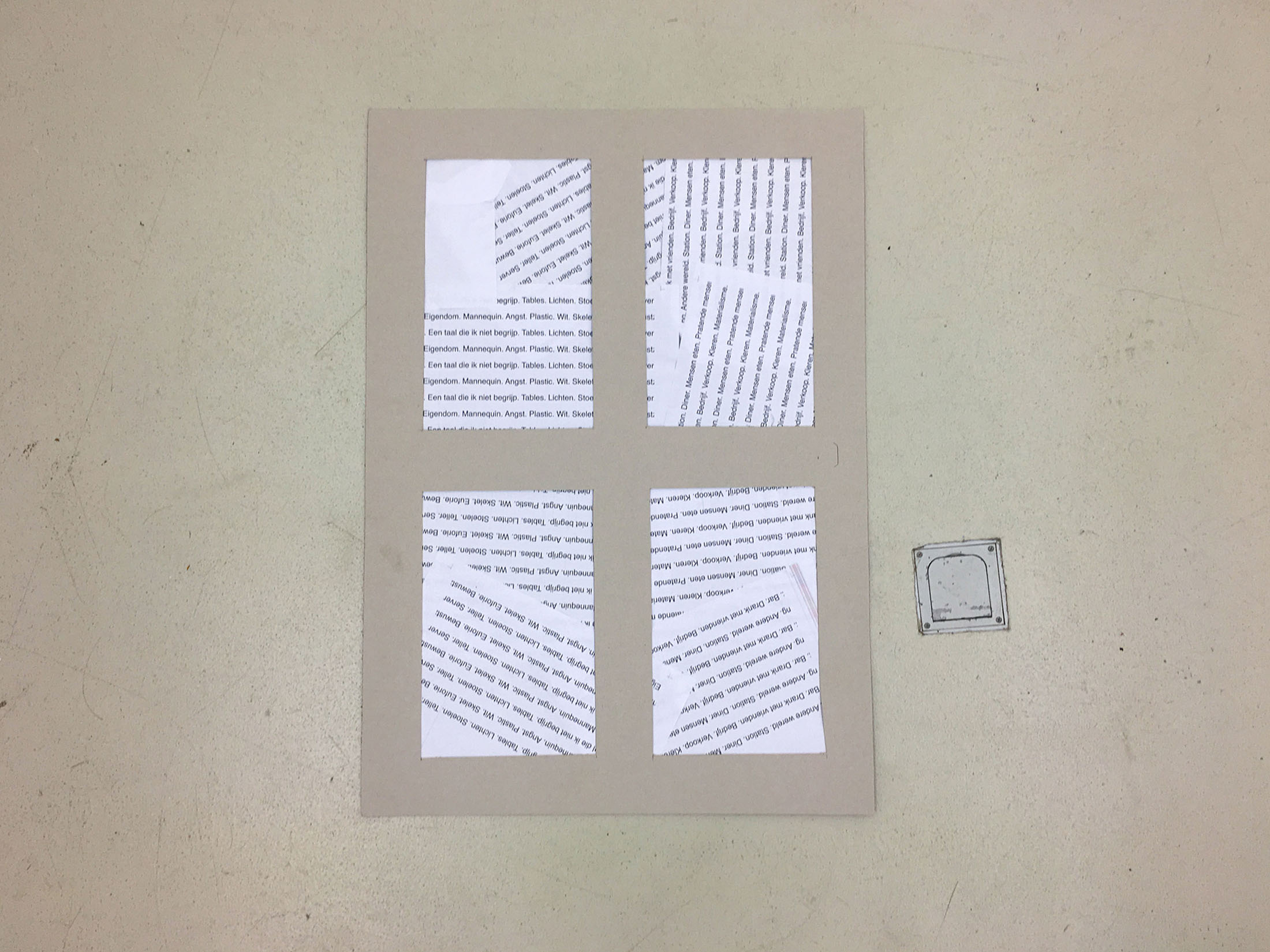
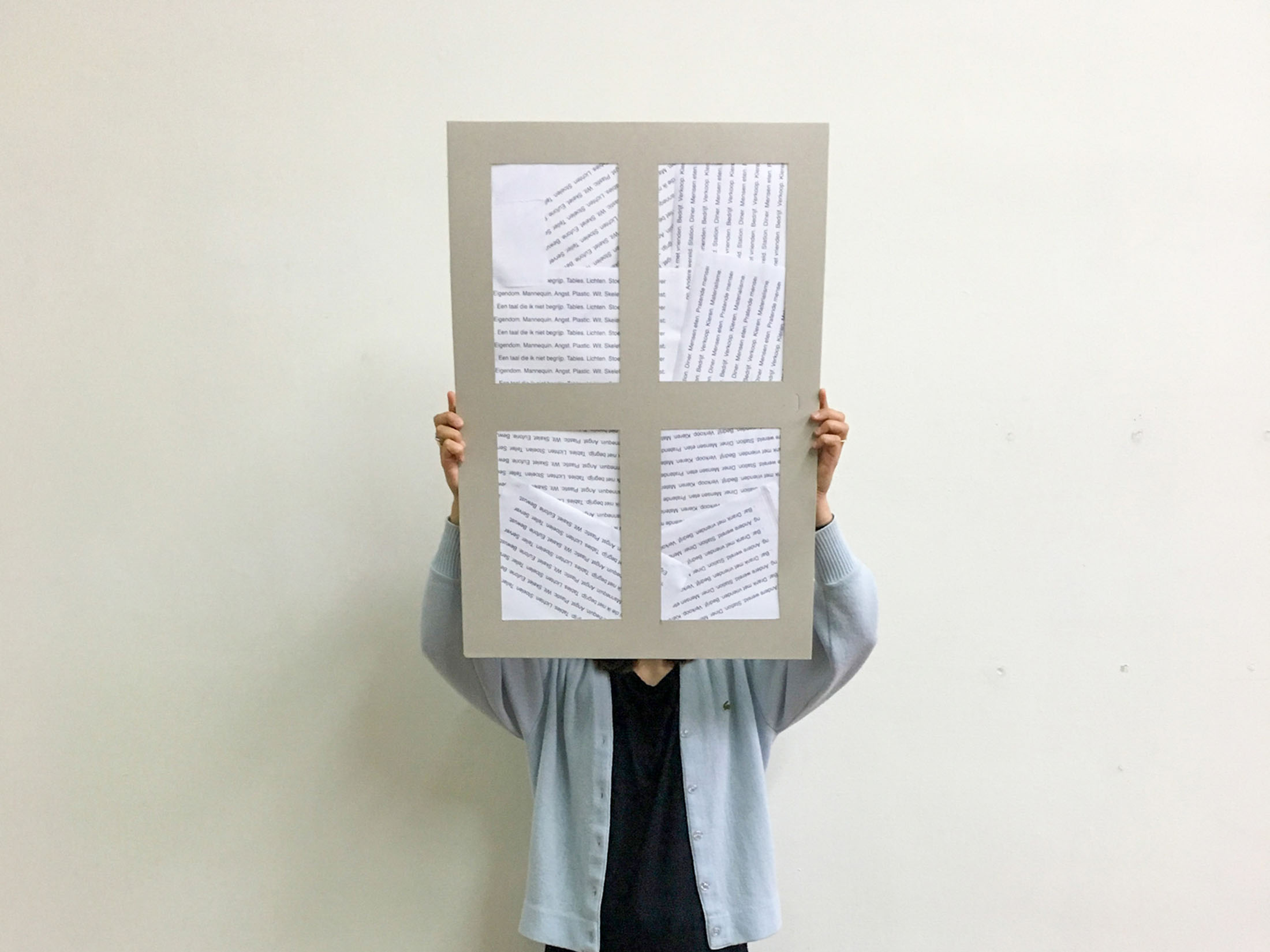
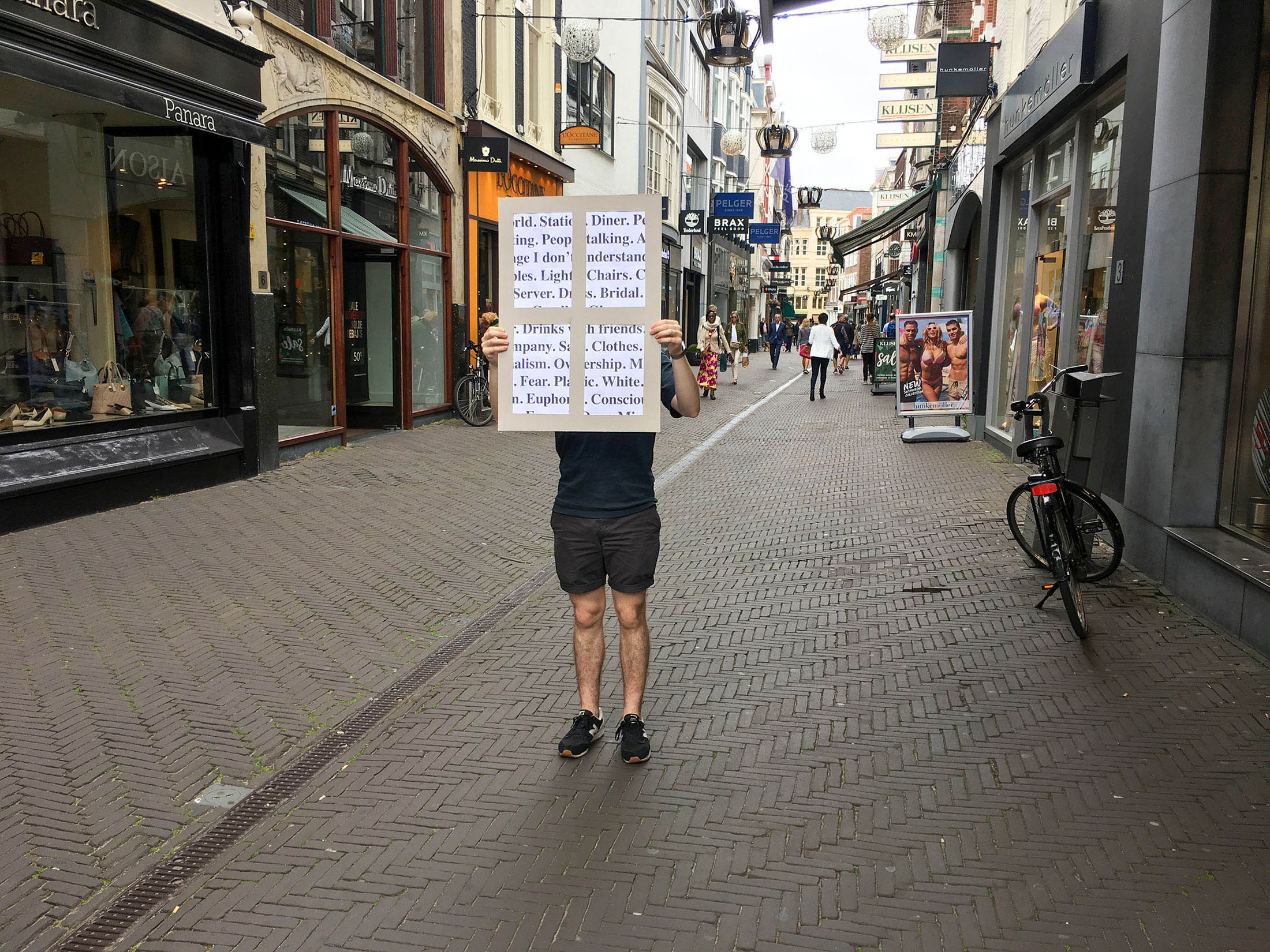
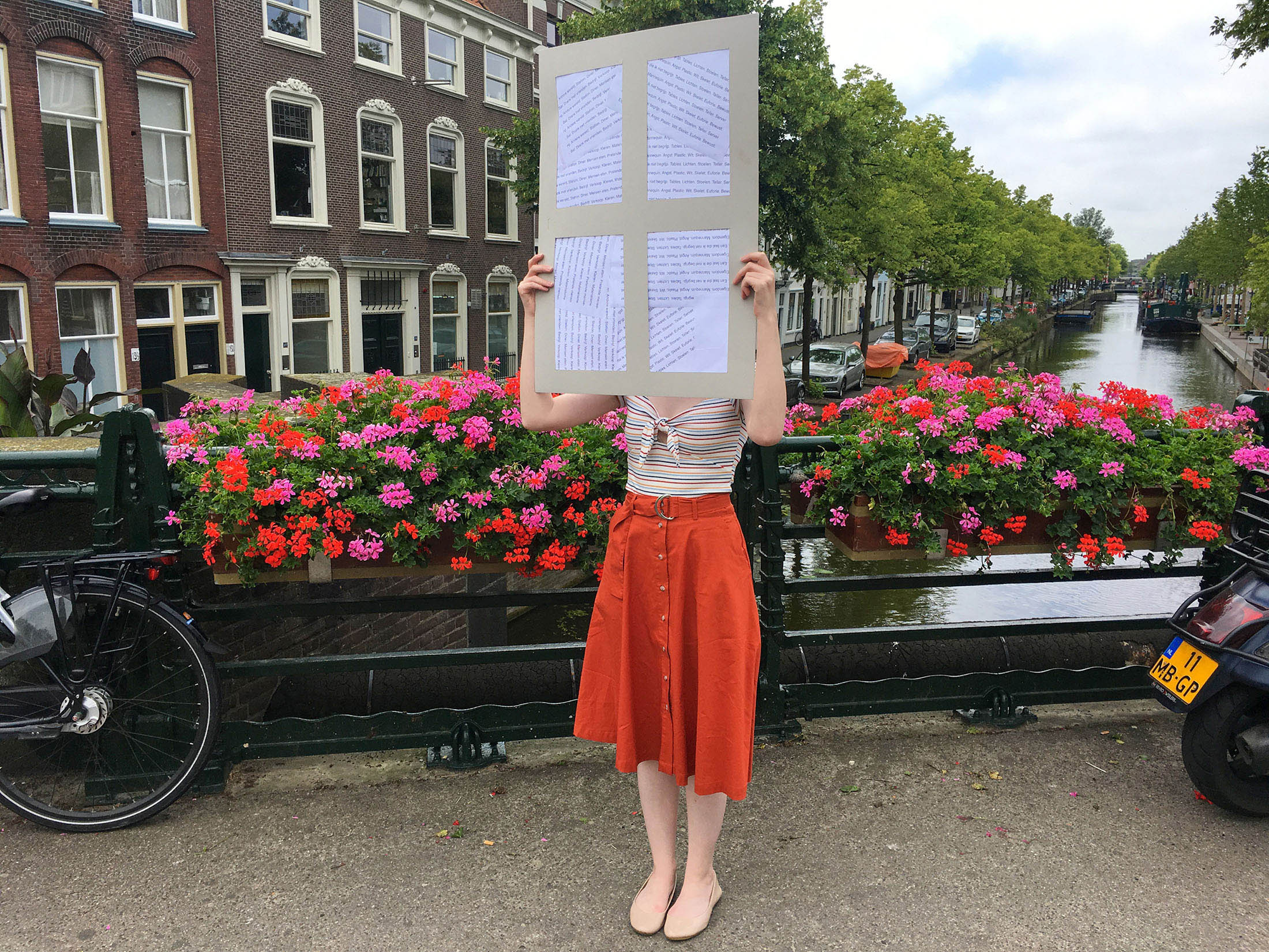
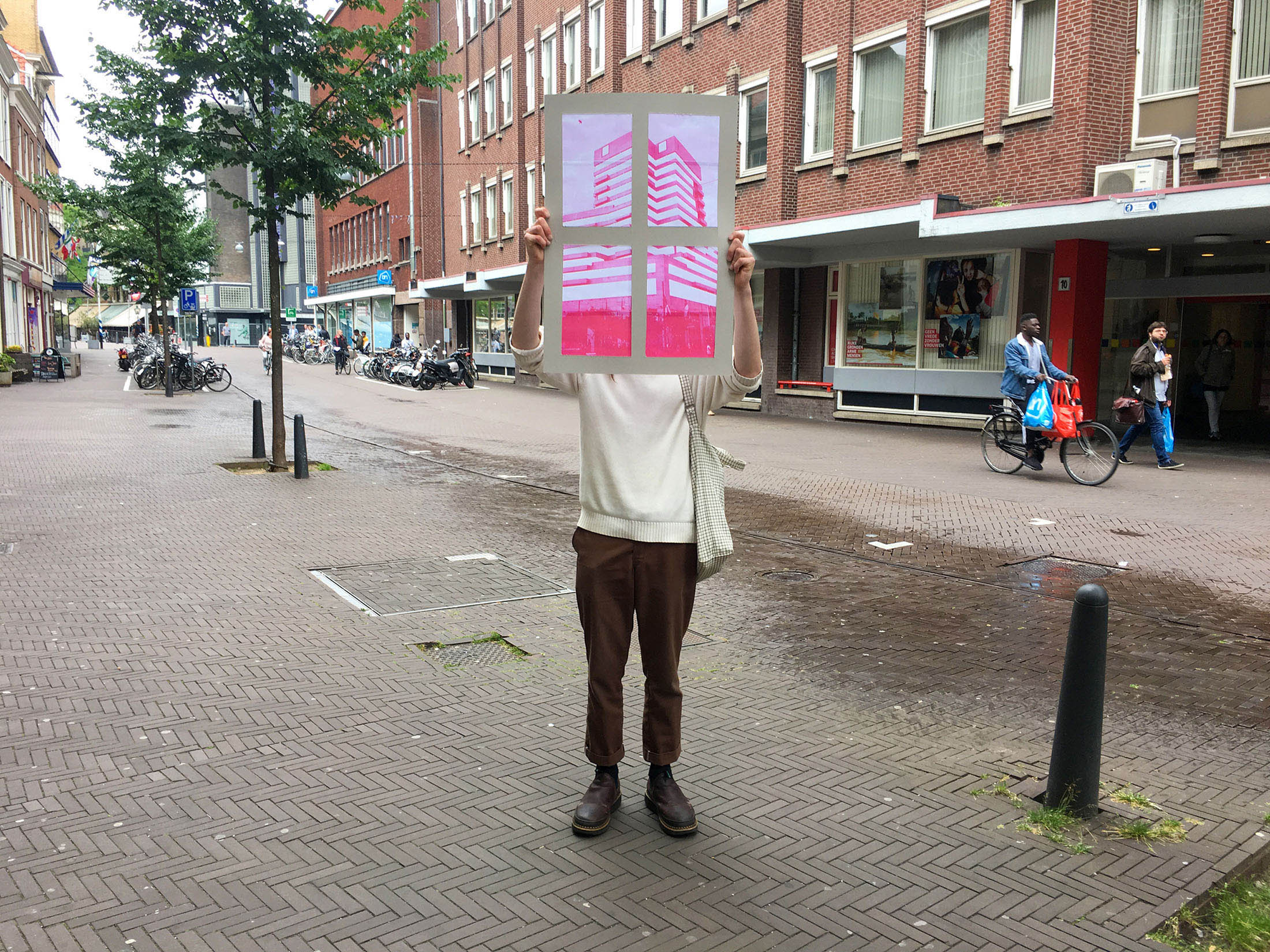
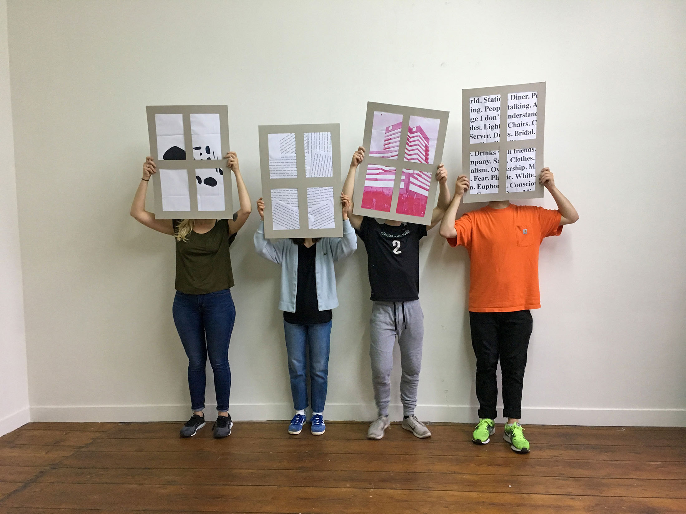
I thought of it as "window shopping,” a whole country - only half engaged based on my understanding, with worlds inside and outside these stores that were foreign to me. This led me to deconstruct the city around me across a few compositions, attempting to express my peers’ and my own perceptions of it through windows.
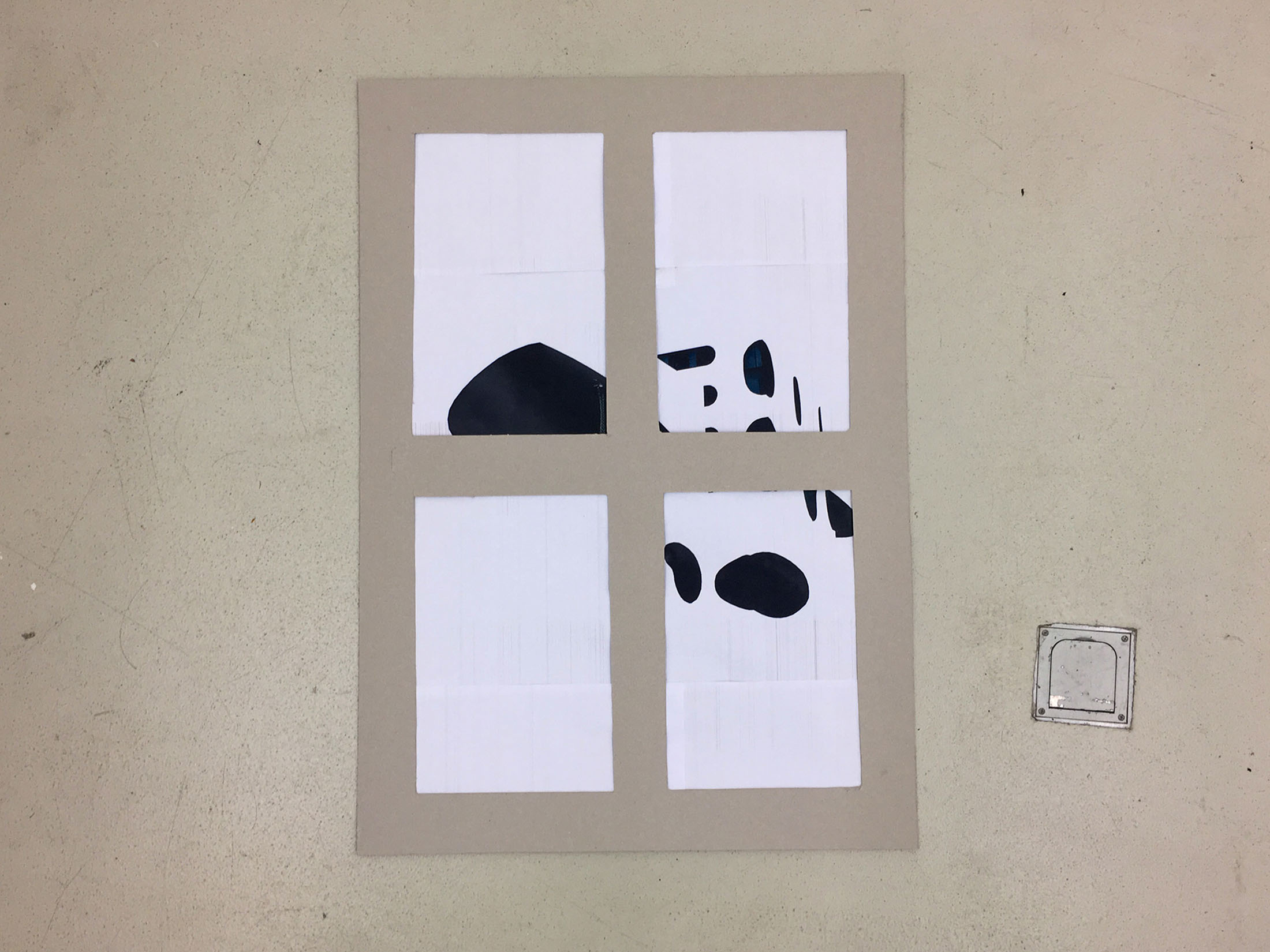
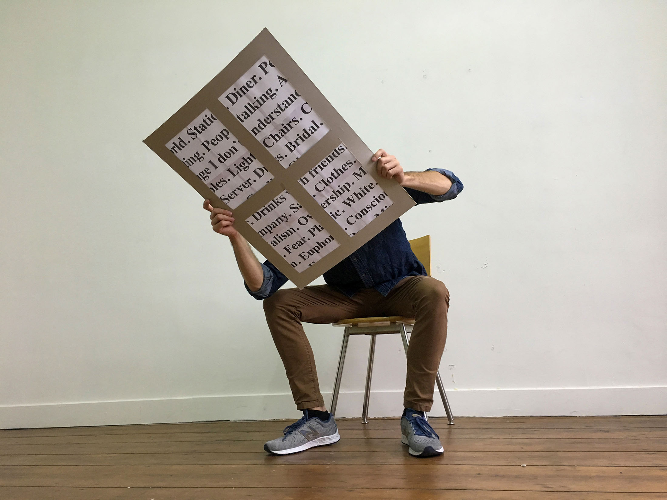
Then, I built some physical windows to express "window shopping" through a country, framing the ideas and visuals from what I was experiencing.
Finally, I returned those windows to the streets, showcasing them around my peers and the spaces that inspired them.
Project 2
Dutch Designer Rob van de Nieuwenhuizen of studio Drawswords led our second project. In this stage, I expanded on my ideas around perception and exploration from Project One. Now that my peers and I had spent much time taking in The Hague, we were tasked with returning to somewhere we had been and finding a common theme to design around. Additionally, whatever we decided to produce from our exploration would soon be showcased in a gallery exhibit that we were to curate on our own. After a short discussion, we decided our investigations would be based on a loose theme: "Fuck the Internet.”

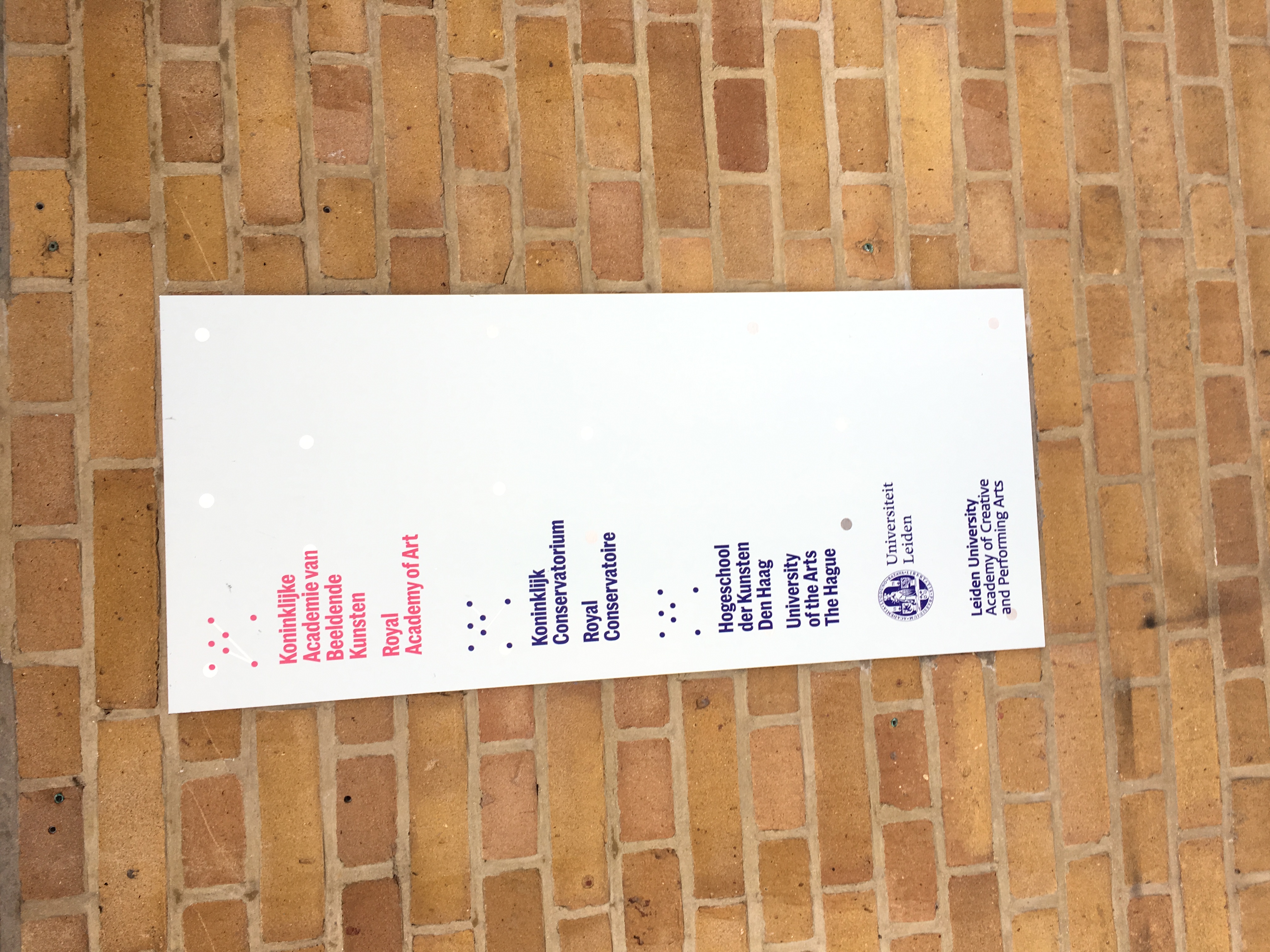
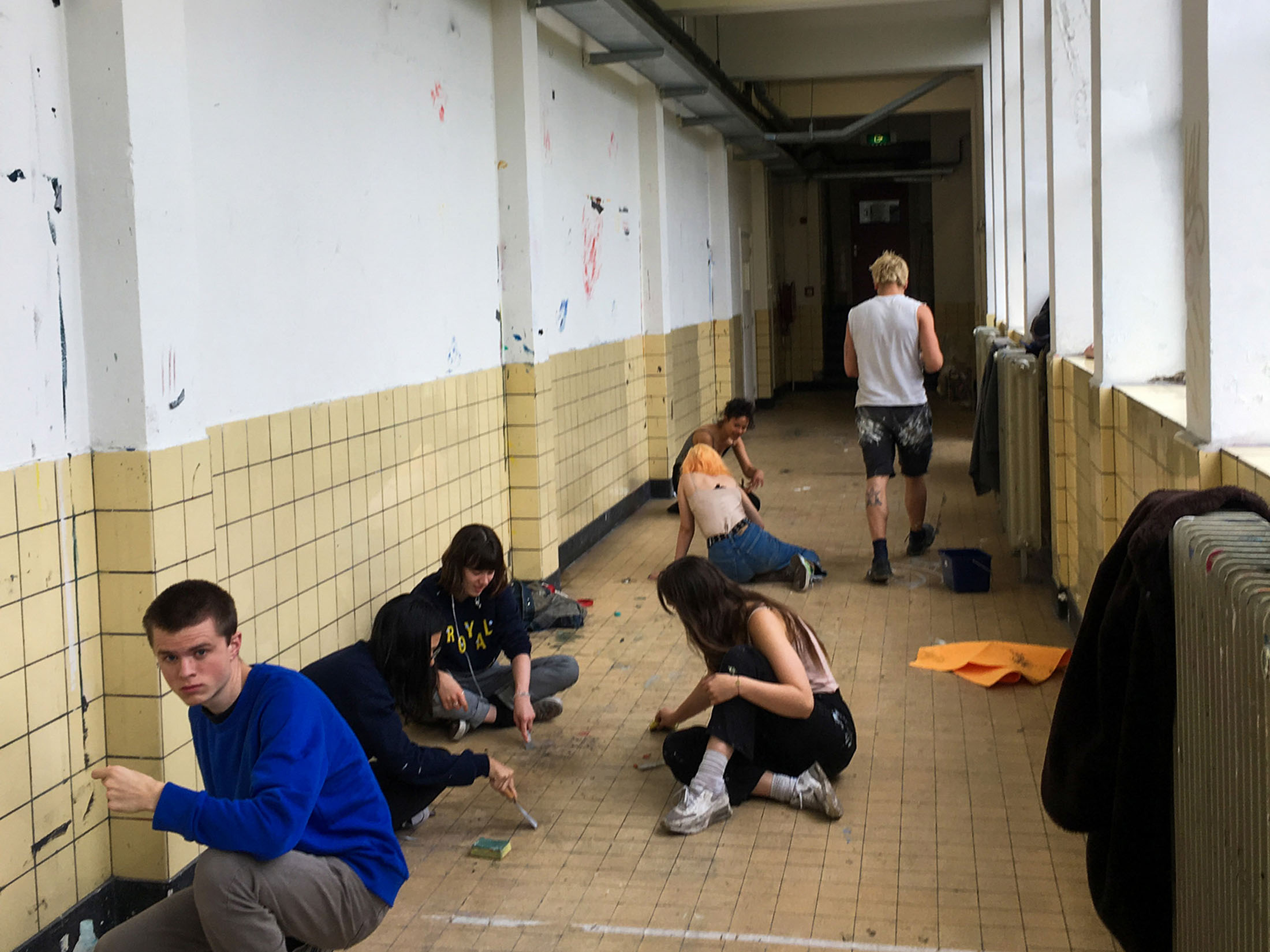
Open to interpretation, we set off to find inspiration. Many took the prompt as avoiding the internet entirely, opting to visit a nude beach to further disconnect from any aspect of technology. I personally decided to visit Leiden University, a Royal Academy of Arts in The Hague, hoping to visit their expansive library and learn about the school’s history. Instead, I found the school and its students in flux, frantically finishing their final projects for the school’s soon-to-be public showcase of its graduating master’s students’ work.
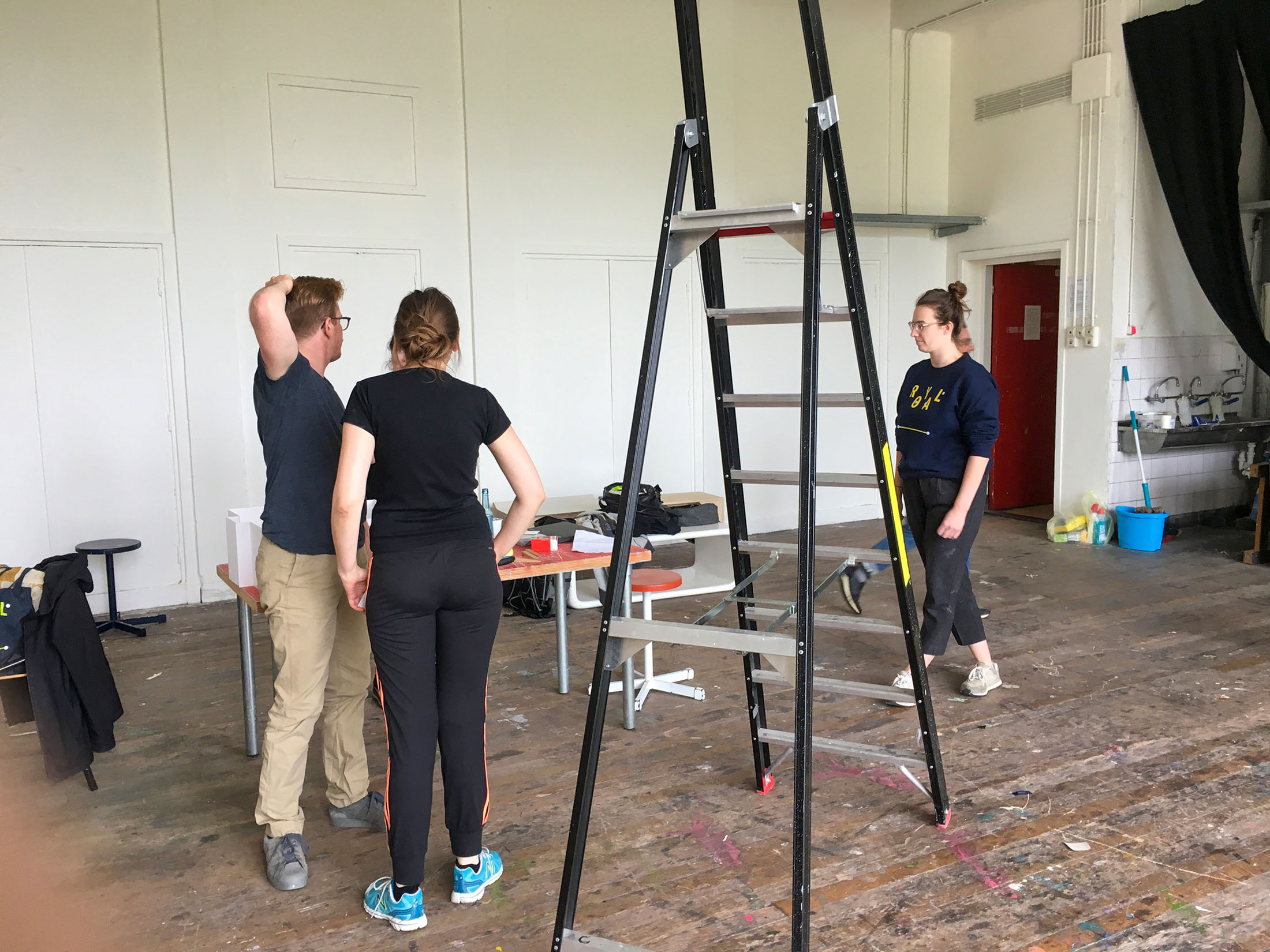
Pictured: Graduating Masters Students scraping paint from the schools’ walls

Opting to learn about the school by talking to its students, I befriended two students, Malou Bumbum and Anna Kieblesz. Following my intuition, I spoke with them about their experiences with the school while assisting them in setting up their work.
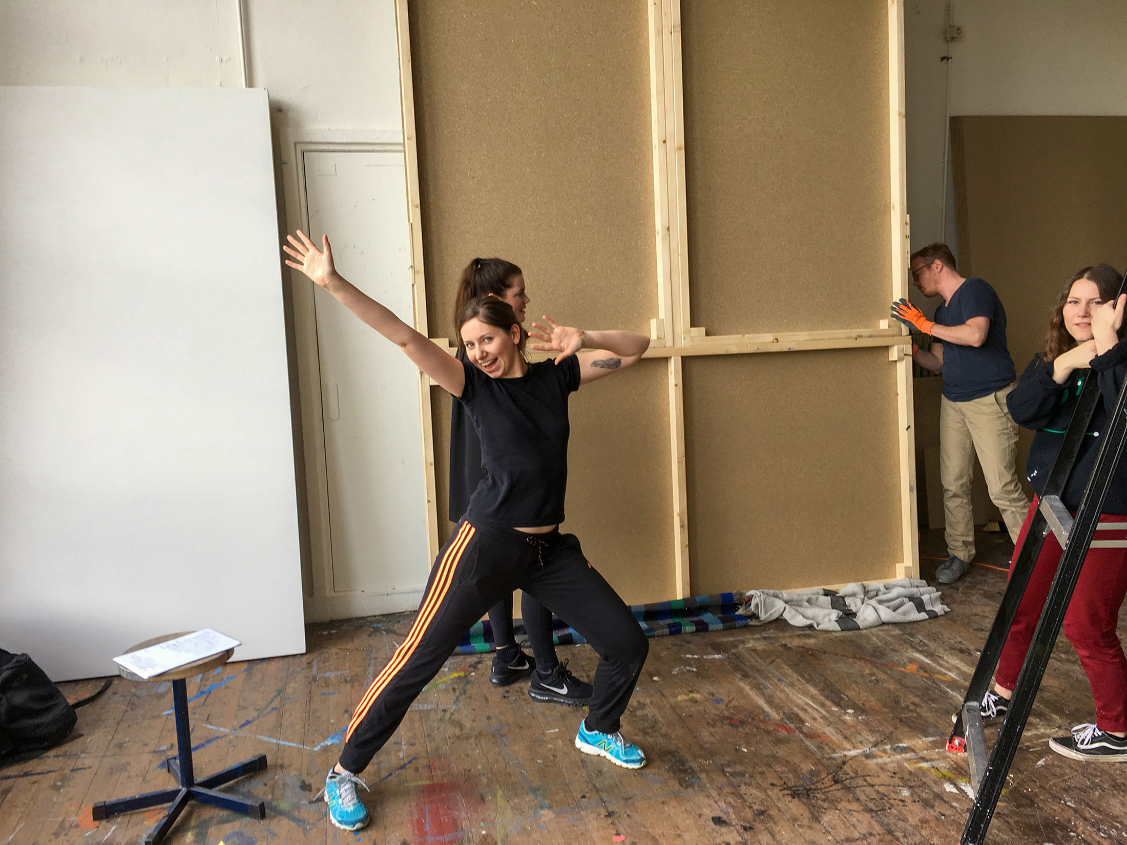
Pictured: Anna preparing a scene to display her photography

Pictured: Anna dancing

Malou nearing her graduation with a master’s in photography, expressed her disinterest in the reality of her craft’s industry. "I've used it as a form of therapy for myself... I really want to work as an art therapist later on". Having just graduated from the College for Creative Studies the month prior, I empathized with that sentiment; kinship between two unsure college graduates.
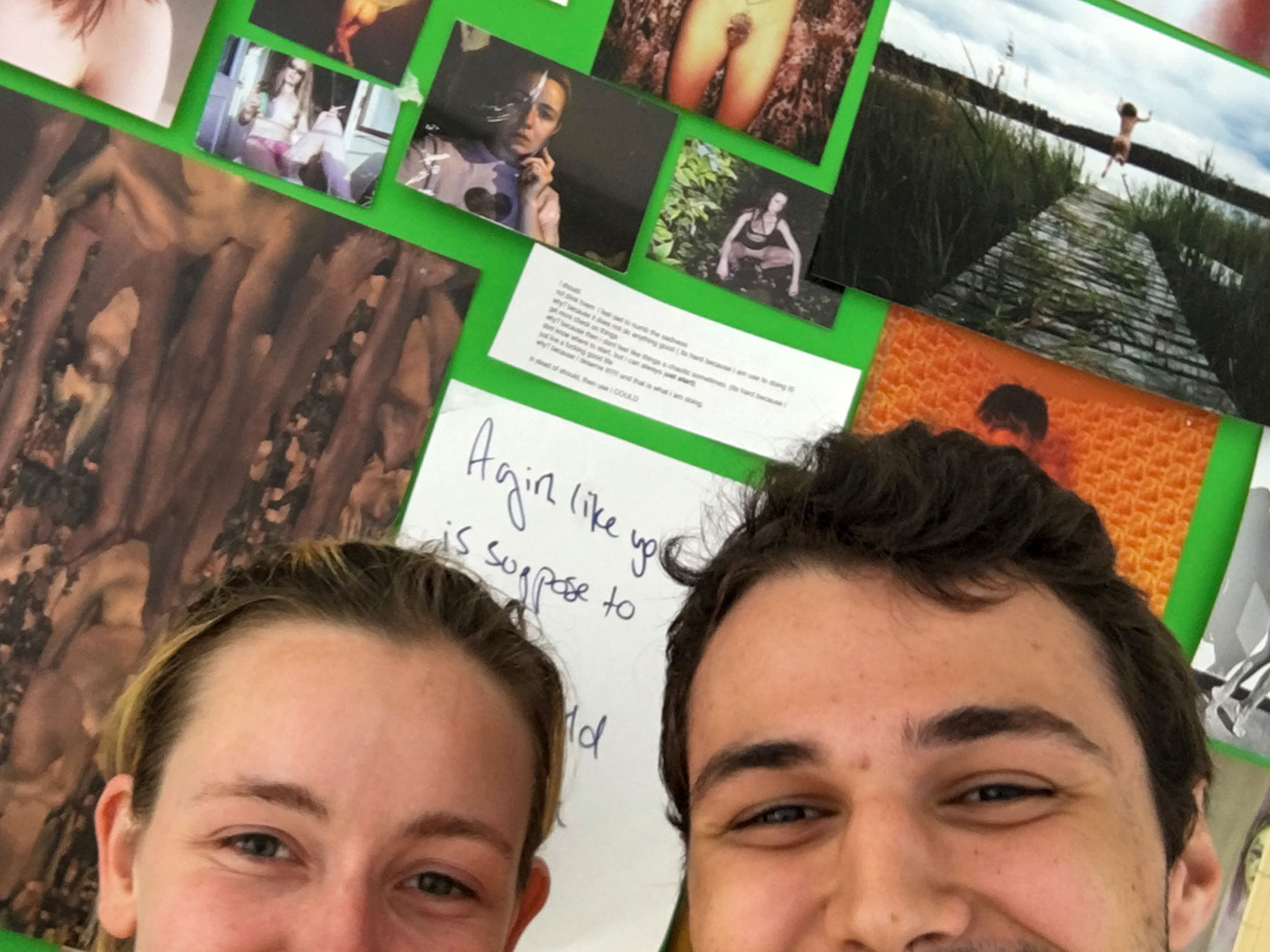
Pictured: Malou and I

My talk with Malou grounded my thought process in photography and self-expression. Why do we take pictures of ourselves? Why do we visually document the world around us? What do the pictures we take say about ourselves? What do they say about the people or places they depict? Inspired by Malou while avoiding the internet in my exploration, I sought further insight into the school and its students through photography.
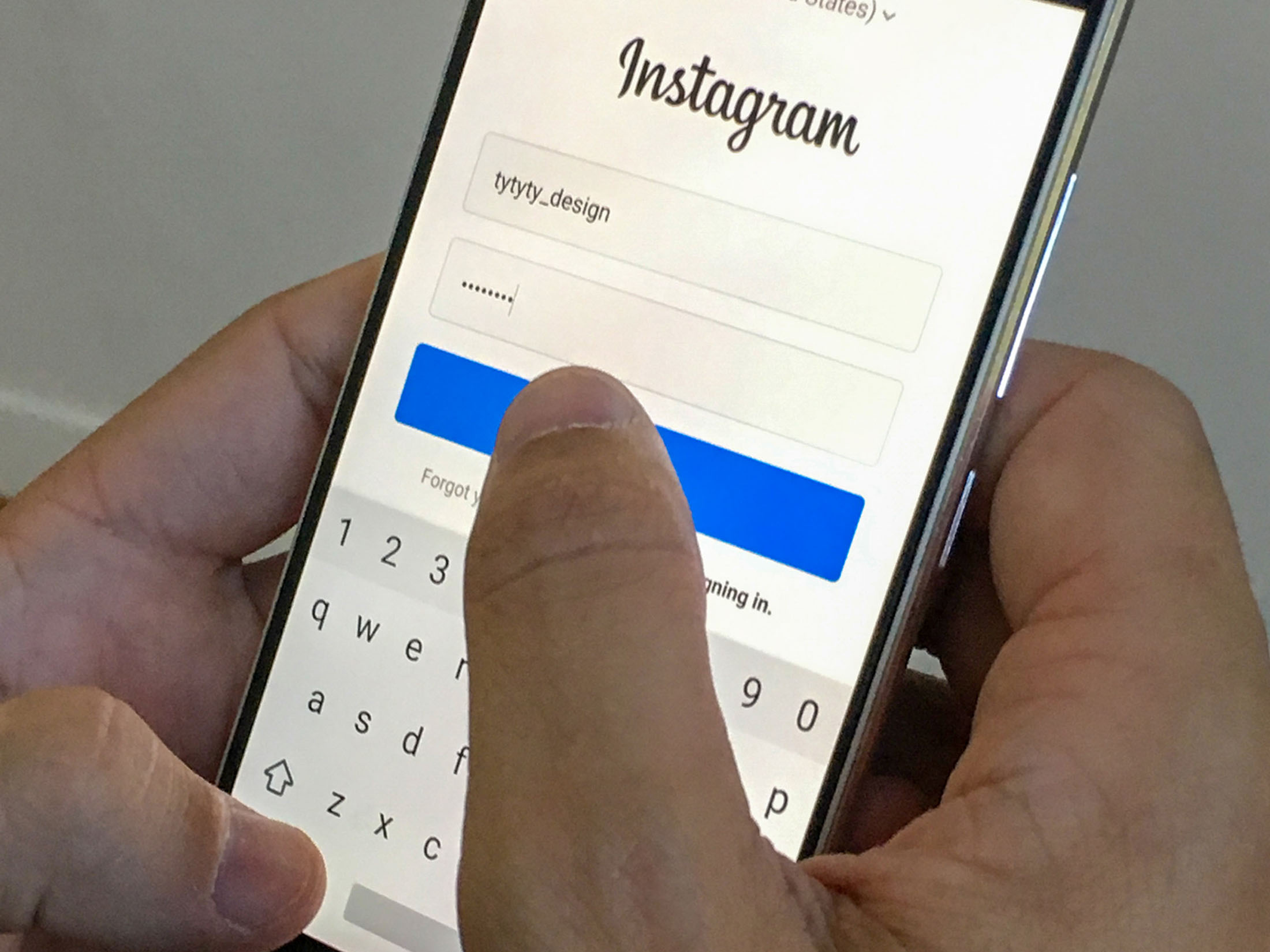
I decided to create a platform for the students to express their frantic thoughts. This led me to utilize Instagram, disrupting the website’s usual status quo of personal accounts run by individuals by making it accessible to potentially infinite people, embracing the theme of “Fuck the Internet” around my other experiences.
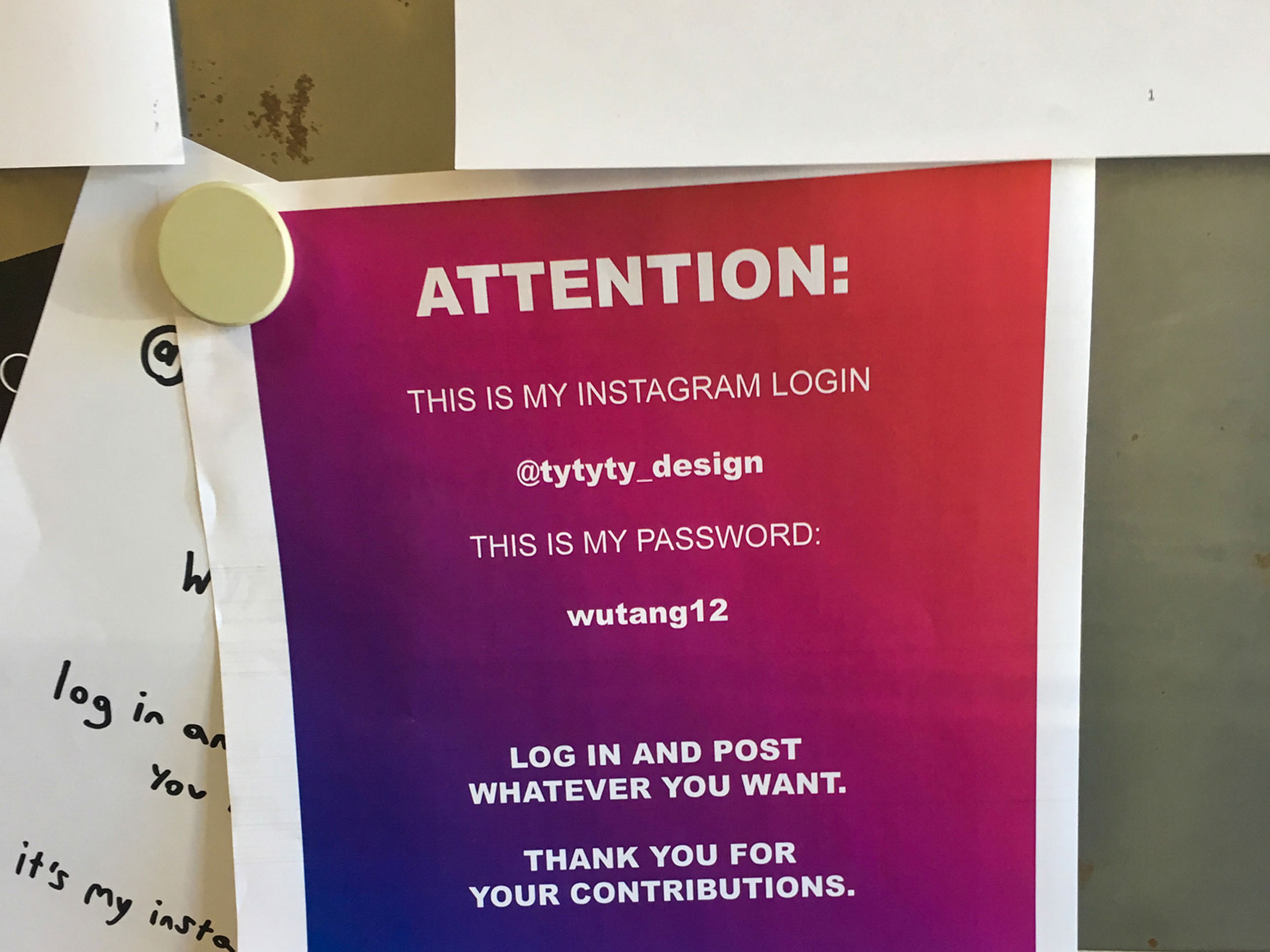
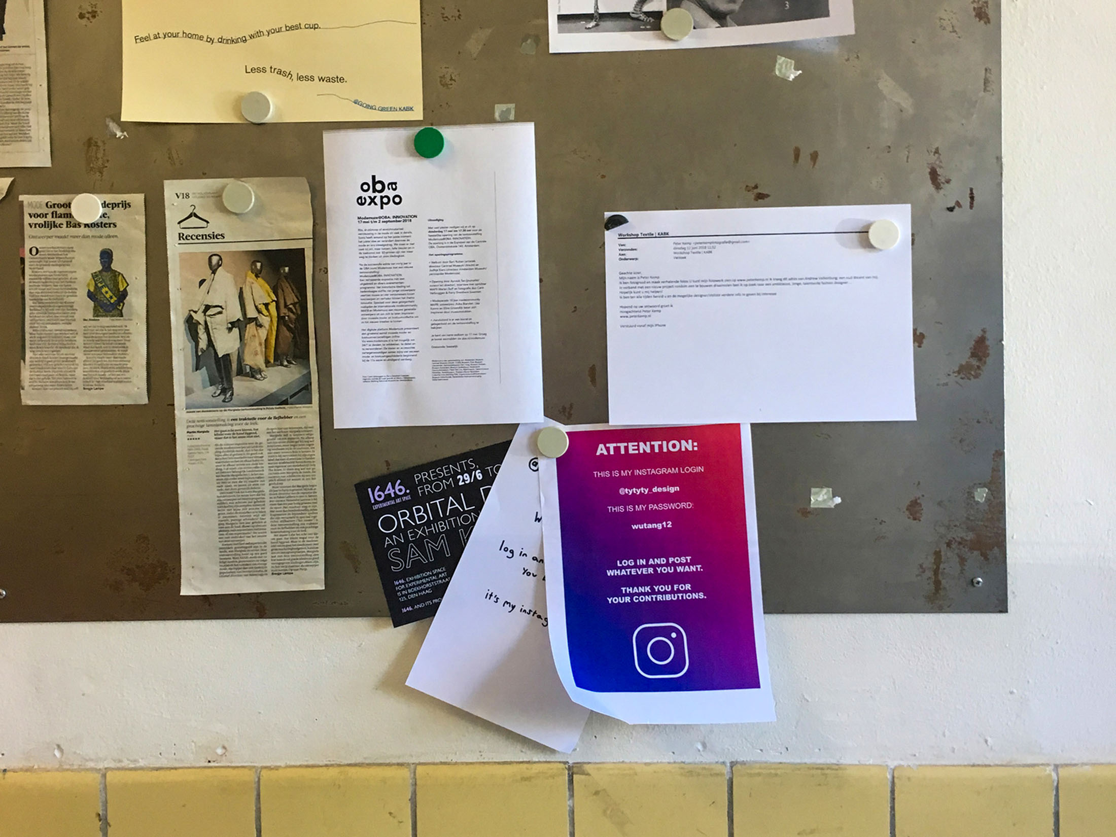
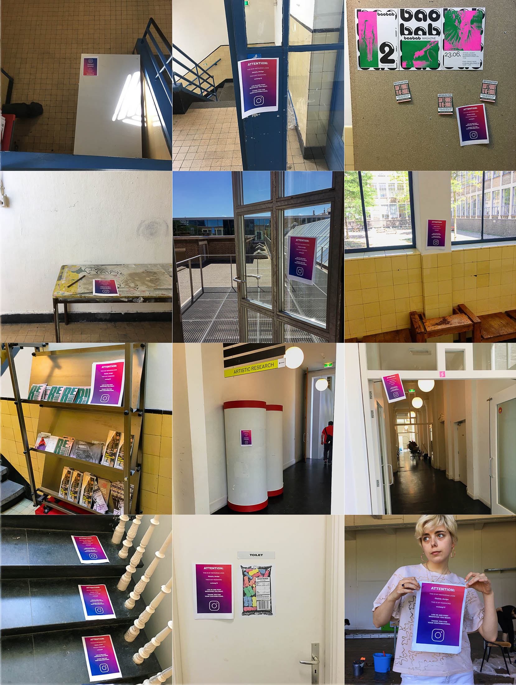
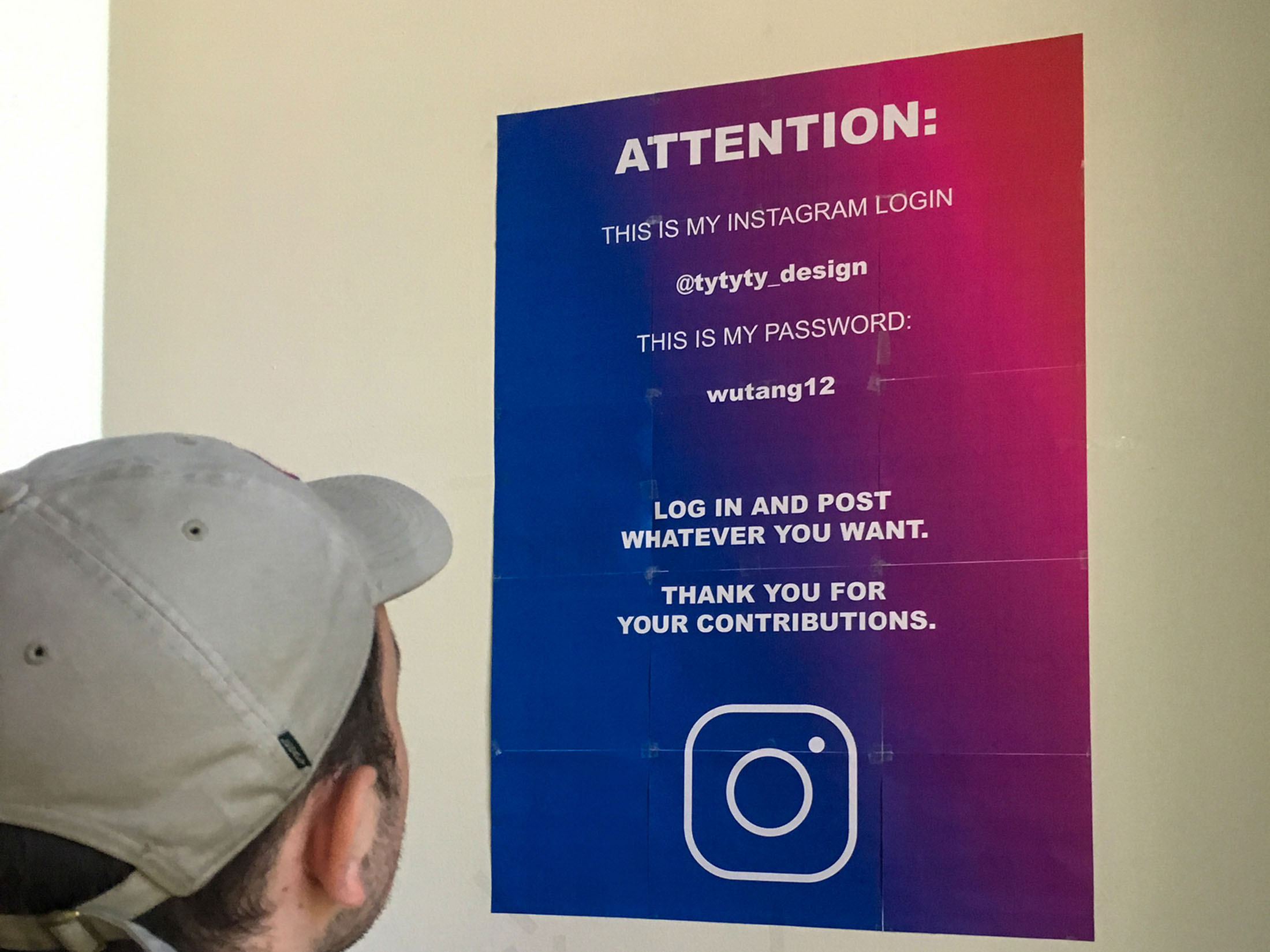
I printed a mountain of flyers to post throughout the academy, displaying the login for a sacrificial Instagram. Anyone could log in, edit the account and post whatever they pleased. After the posters went up and the account was now in the hands of the public, things got weird.
Pictured: Flyers


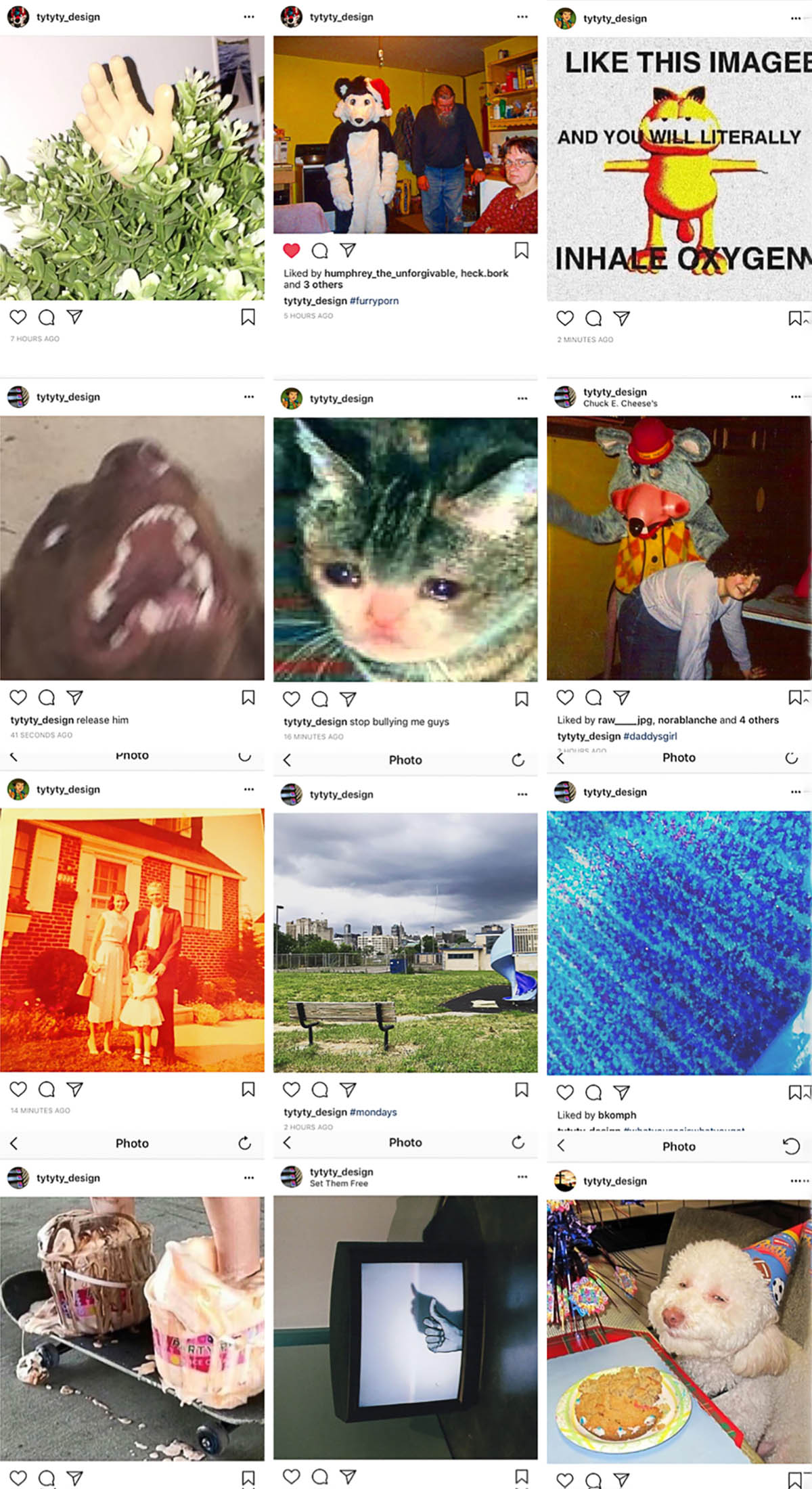
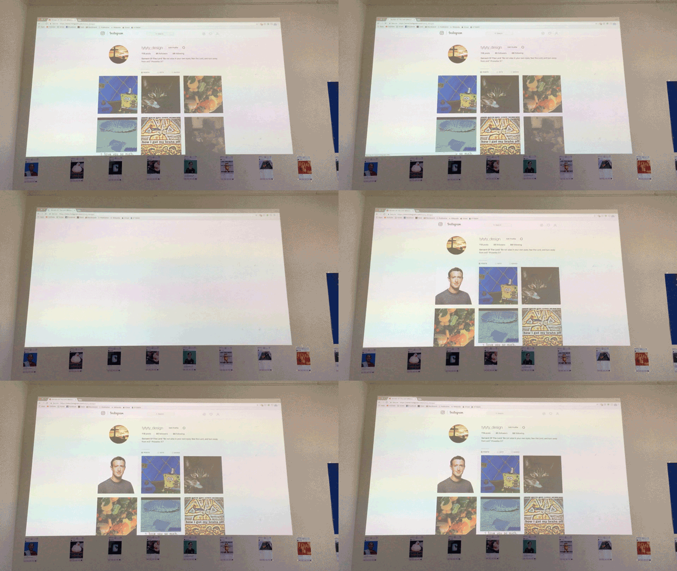
Over two days, over 100 photos were posted by anonymous students and peers. A slowly compounding showcase of photos from anyone who stumbled upon the account. A mess of ideas, memes, and the innermost feelings of complete strangers.
Pictured: Instagram

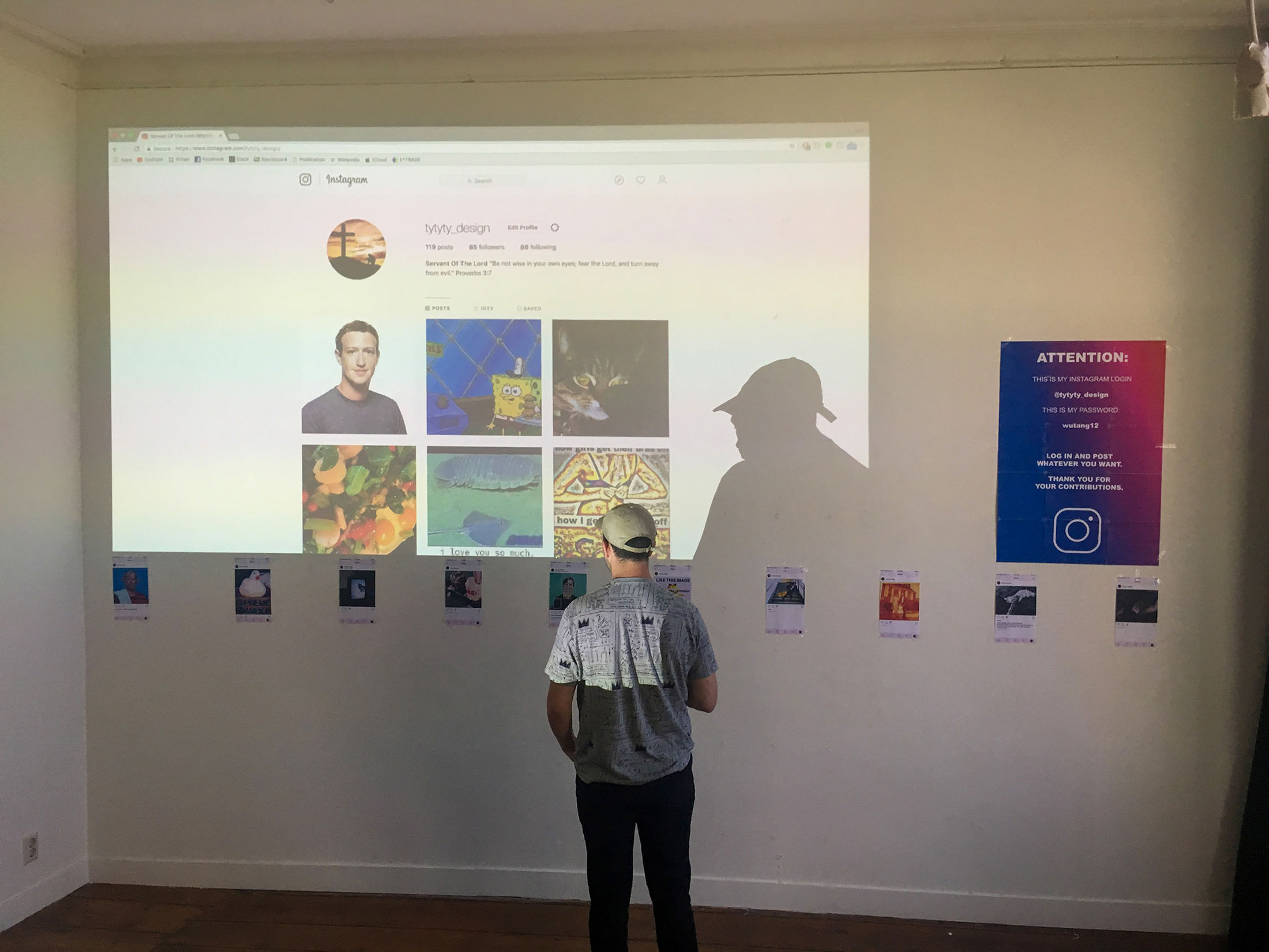
Trying to showcase whatever I had accomplished, I decided a portion of the gallery would showcase the photos that were finding their way onto the Instagram account.

As well, anyone in the gallery could take a photo, post it to the Instagram account and see their images in real-time.


It wasn’t long before someone logged on and changed the password, locking everyone, including myself, out of the account. Today, remnants of the account still exist, but I no longer have access. It stands as a monument to an obscure perspective of the internet and a handful of anonymous manic students with little flashes of their worlds shown through the photographs.
My experience during Re-Program changed my perception of what it means to think through a design problem. The most expressive ideas can often be found where least expected, and engaging with those ideas and the people or culture they exist around can often lead to the most exciting results. It’s a process that’s both natural and precise; creations made from a perception informed by everything but myself, speaking on their own merit.
As a final send-off to this experience, I compiled the 1,000 or so photos I took during the three weeks into a video.
Thanks for viewing Re-Program. Feel free to check out some of my other projects. Or not.
